Statistics: the demographics of Sweden
Demographic transition- stage 4
2.5 deaths out of 1000 live births- low infant mortality
1.7 children per household
ratio of about 1:1 male:female overall
main ethnicity: Swedish
Birth Rate 10.14 births/1000 pop.
Death Rate 10.2 deaths per 1000 pop.
Life Expectancy 80.97 years
Average age 41.7 years
18.3 % of ppl are over 65
Dependency load is 33%
(CIA and PRB)
Analysis
The country of sweden has very many aged people. This could potentally cause a problem with a huge dependancy load. The low death rates in sweden mean that there is very good sanitation and healthcare. However, the high dependency load would make the taxes high. The mean age is 41.7 years old, leading us to believe that a lot of the population is still working aged. There is a high life expectancy, which indicates a developed nation. The ration of 1:1 male to female is a good thing, meaning that there are no large single-gender health problems.
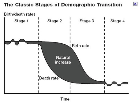
Demographic transition from 1750
Sweden is a good example of the Demographic transition, because the Swedish people have kept population records for a very long time. Before 1750 Sweden was in the 1st stage of demographic transition. From 1750 to 1800 Sweden was in the second stage of demographic transition. From 1850 to 1930 there was a population boom, accompanied by the industrial revolution, which placed stress on the agrarian society. Around 1930 the birth rate started to decline, and Sweden entered stage 4 of the demographic transition. Like most modern industrialized nations, Sweden is now in the fourth stage of the demographic transition. As indicated in the graph, the birth and death rates of Sweden are incredibly close. This shows us that there are very few children and many elderly people. (paragraph from Human Geography index)
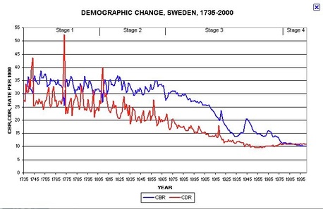
Compare the two graphs. The top one is a graph of the real birth and death rates in sweden, the bottom is an image of the standard demographic transition model. Can you see the different stages in the real data?